PP Masters
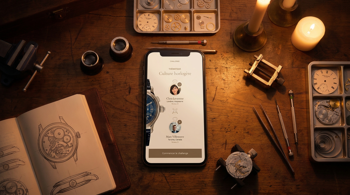
An internal app where Patek Philippe staff duel each other on brand knowledge — six questions, twenty seconds each.
- Client
- Patek Philippe
- Produced at
- Virtua/Smile
- Type of work
- Software, mobile
- Year
- 2018-2019
- The problem
- Rebuild Patek Philippe’s brand-training quiz from scratch, so duels stay fair and staff who’ll never top the rankings keep playing.
- What I did
- Designed the duel, the ranking and a second track of badges for non-competitive players, plus the rule-based visual system.
- Result
- +15% active users against the previous version
The result
The full case study
How it came together
Context
The app had existed since 2015. Patek Philippe's multimedia department built it in-house and improved it over three versions, but never rethought it. By 2018 the interface had fallen behind the brand, and fewer and fewer people were playing.
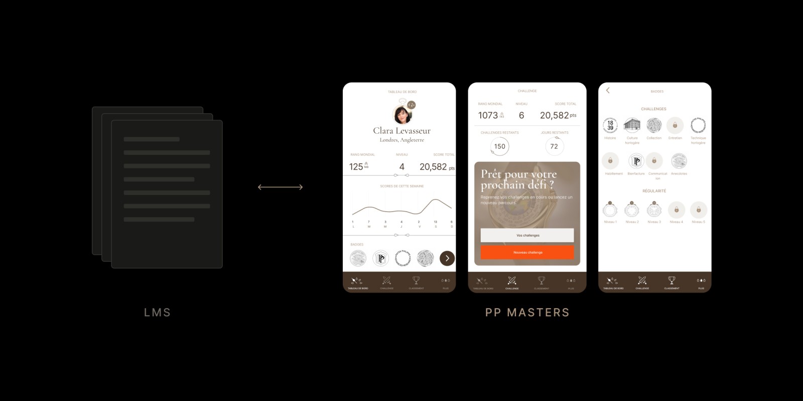
It was never designed as a learning tool. The training material lives in Patek's LMS; PP Masters is where people check what they retained, and the job was to make that worth coming back to. We rebuilt it from scratch — interface, visual system, and the mechanics around the duel.
User needs
No research with the resellers themselves. We had the brief, the previous version and our own prototypes, which we played against each other to test quiz length, question formats and scoring.
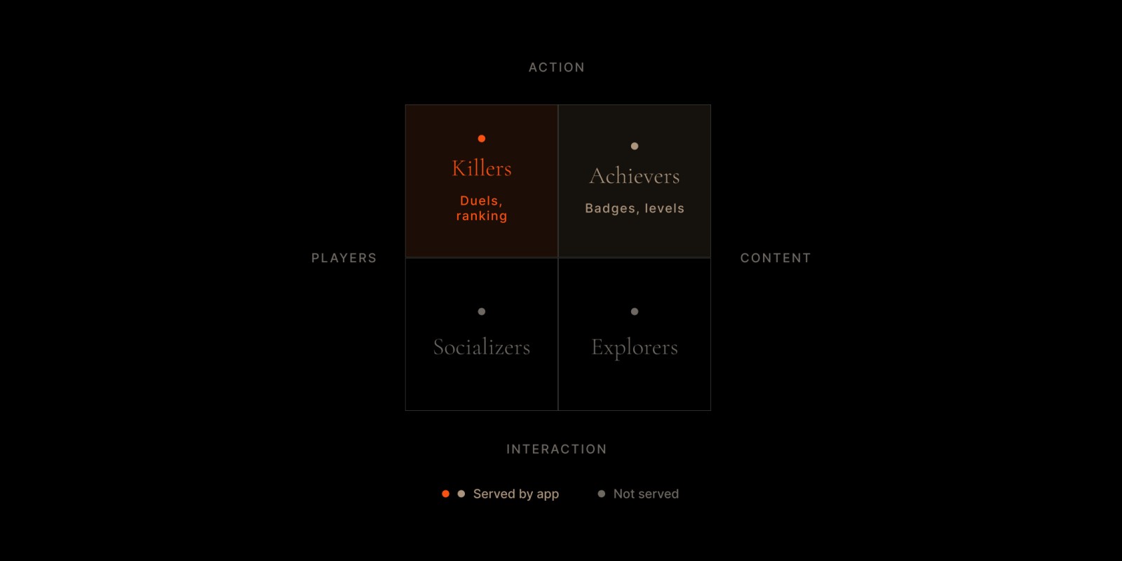
Two things came out of it. The clock mattered more than we'd assumed — more on that below. And not everyone who opens a quiz app wants to win it. Some people will chase the top of the leaderboard; many won't, and an app that only rewards rank gives them nothing to aim for. Bartle's player types put a name on that split. We got there from the inside, and it shaped the second half of the project.
Constraints
- The timed duel was the format. Six questions, twenty seconds each, fixed in the specification.
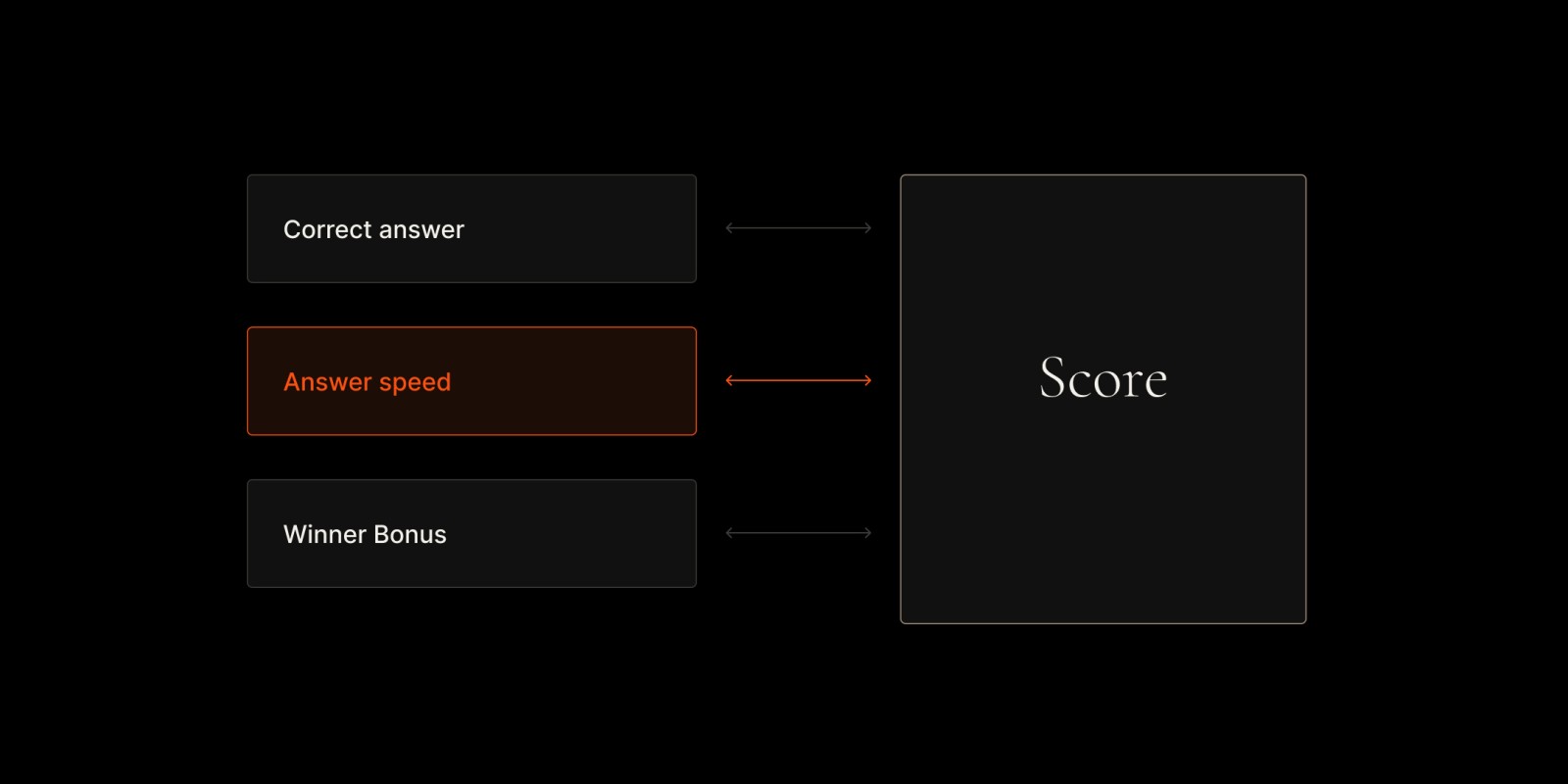
- Answer speed feeds the score. Knowing the answer isn't enough; knowing it fast is what scores.
- Patek writes the questions. Any new format was one more thing their team would have to keep producing.
- Seasons reset. Every year the scores go back to zero.
- Phones vary. Resellers play on whatever they have, all over the world.
The duel
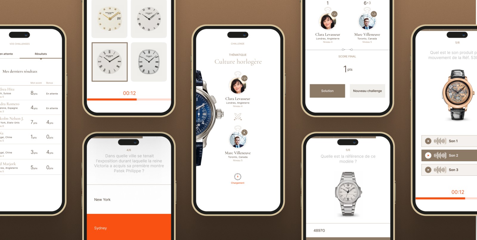
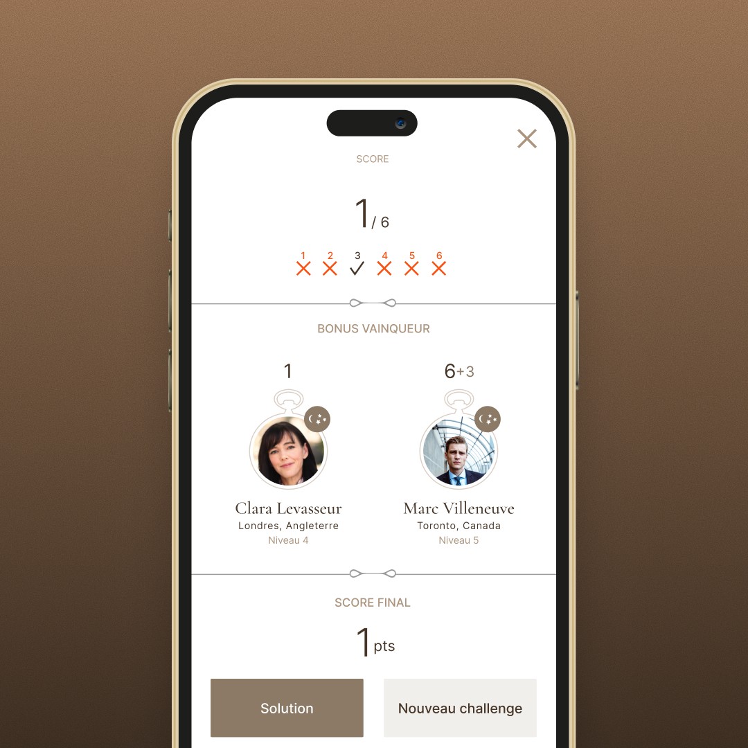
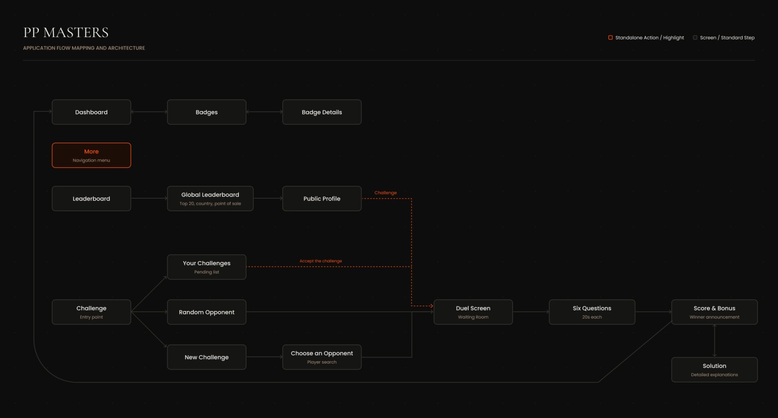
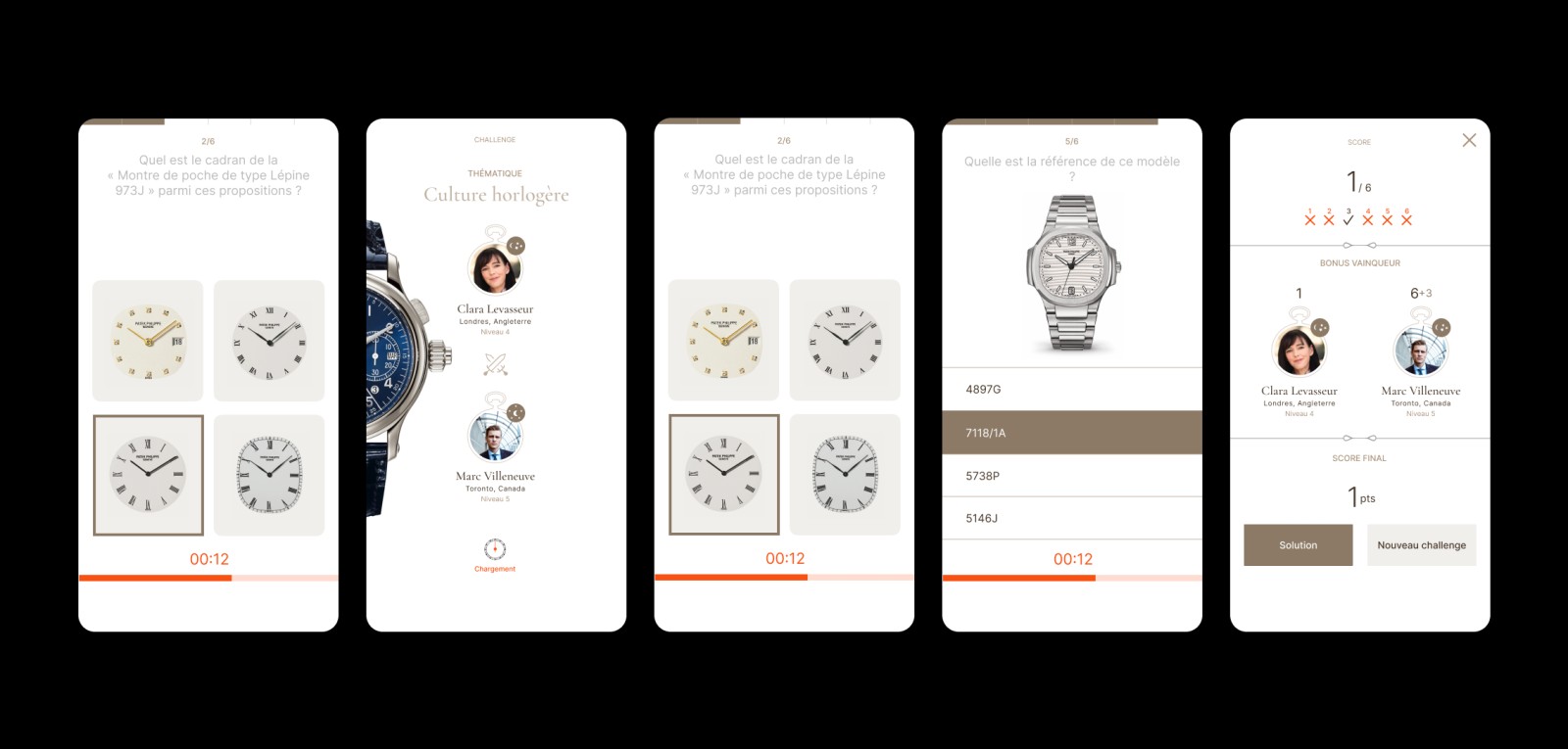
A round is short on purpose. You pick an opponent, at random or by name, and each duel has a theme. Before the first question both players see each other: name, city, level. Then six questions, each with its own twenty-second countdown. Then the result, question by question, before the total.
The app isn’t there to teach, but it does show you where you stand: the solution screen brings back every question with its correct answer, so even a lost duel lets you check what you got wrong.
The formats we dropped
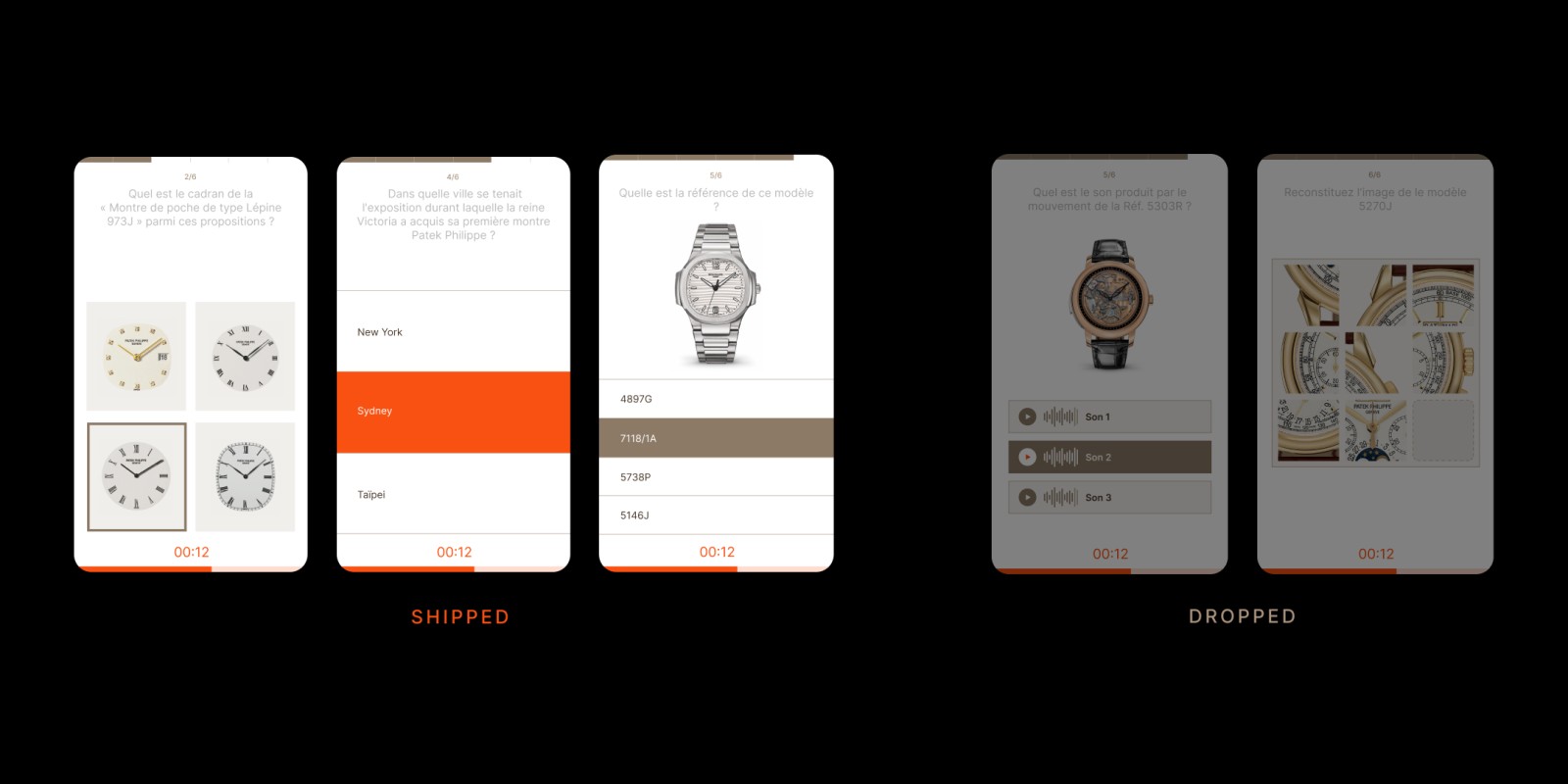
We didn't start with multiple choice alone. The early prototypes had puzzles, sound questions and more — more varied, and more fun to demo. Testing them against each other cut most of it, for two reasons.
The first was upkeep. Every new format meant a new kind of question for Patek's team to write, season after season. The second was fairness. The score depends on answer speed, and on a less powerful phone a richer format costs time before you can even answer. A reseller with an older device would lose points for reasons that had nothing to do with what they knew.
What stayed: text answers, and image questions — dials, references — where recognising the watch is exactly what's being tested.
The ranking
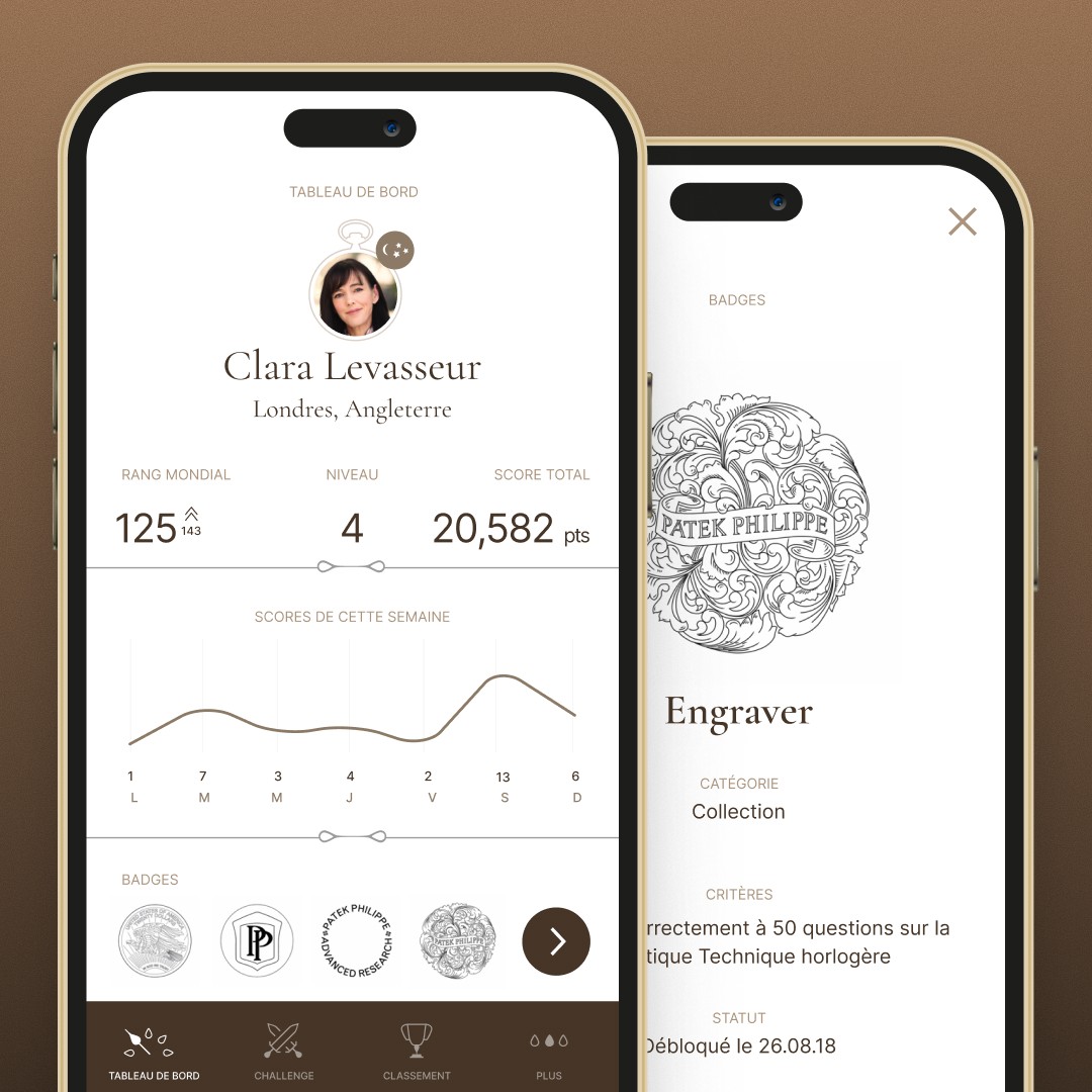
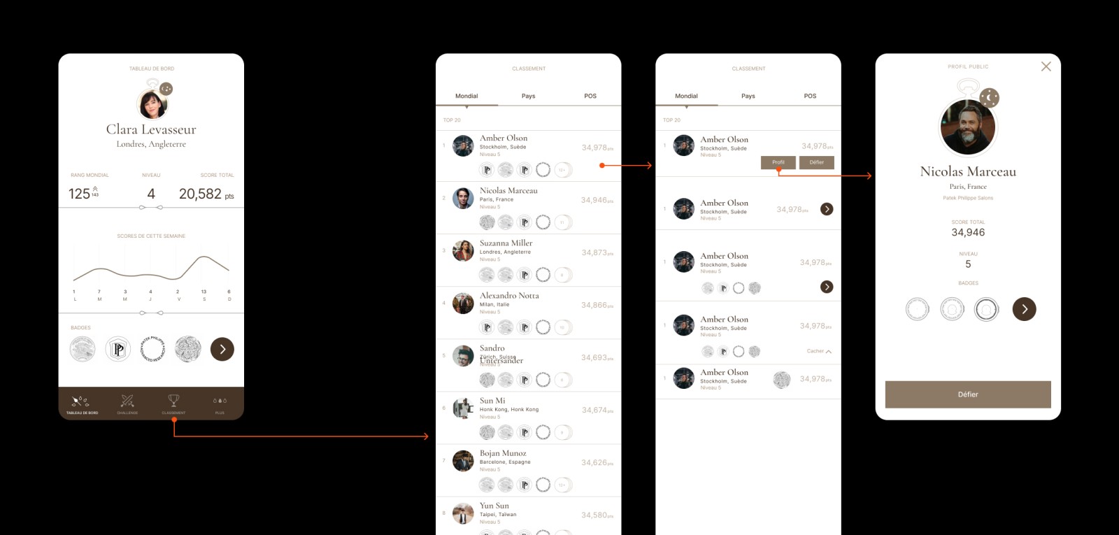
Scores feed three leaderboards: worldwide, by country and by point of sale, so you can measure yourself against everyone without losing sight of your own boutique. Every line on the leaderboard is a person — name, city, badges, and a button to challenge them.
The dashboard brings it together: rank, level, total score, the week's activity. It's also where the ranking shows its limit. A leaderboard is a list of winners, and most of the people reading it aren't on it.
The second track
If speed decides the score and the ranking only rewards the top of the table, the ranking can't be the only reward.
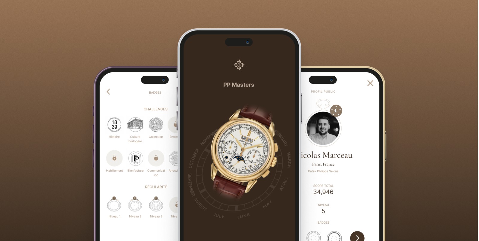
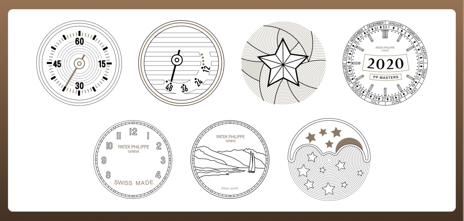
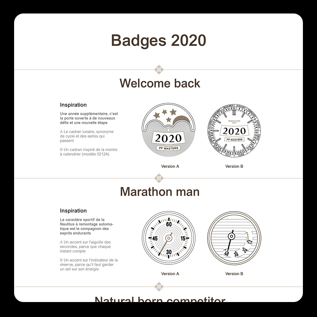
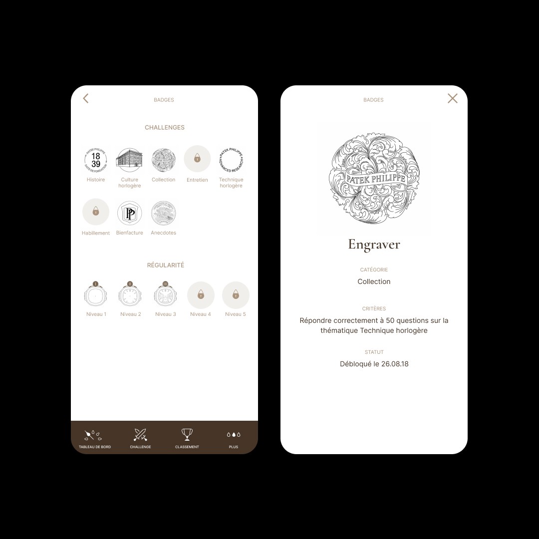
So badges became a second track, running beside the first. Their conditions are fixed, and you earn them against yourself rather than against a colleague in another timezone: answer fifty questions right on a theme, play regularly enough to reach the next level. Eight themes, five levels of regularity, each with its condition shown on the badge and a padlock until it's met.
I drew them from Patek's own watches and heritage — dials, cases, engravings, the founding year. Nobody asked for that. The client hadn't expected it, and loved it.
The visual system
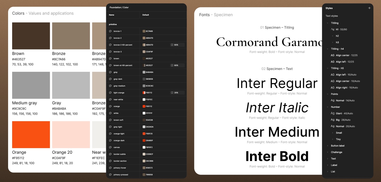
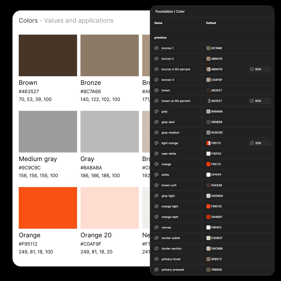
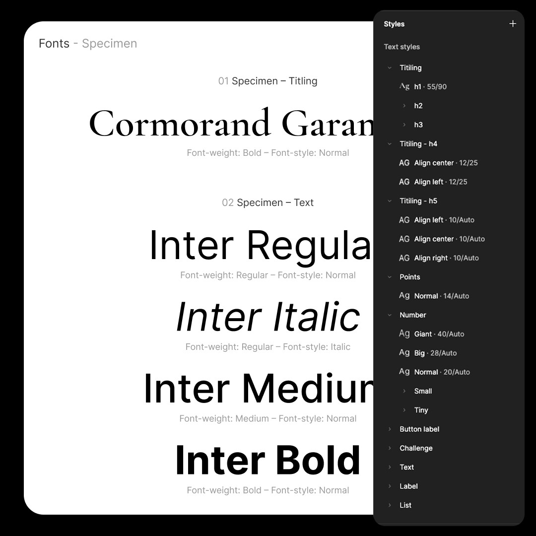
Colour, type, icons and component states were set down as rules rather than drawn screen by screen, so new screens could be assembled instead of redesigned. Each colour has its job written next to the swatch: brown for text, bronze for primary actions, grey for locked states, orange for feedback and alerts. That's why orange is kept for the clock and for answer feedback, and nothing else.
Watch details carry into the interface too. Profile pictures sit in a pocket-watch case, and the Calatrava cross is used as an ornament.
Metrics
+15%
Active users against the previous version — the 2015–2017 one.
No accessibility pass. It wasn't in the brief and no audit was run. Better to say so here than leave it to be noticed.
Conclusion
On paper it was a redesign. The real subject turned out to be the mechanics: a clock that measured phones as much as knowledge, and a ranking that only ever spoke to the people at the top. Dropping the richer formats dealt with the first. Adding a second way to progress dealt with the second.
What I'd do differently
Raise accessibility even though nobody asked — contrast, motion, and a timer that works against anyone who reads more slowly. Bartle's grid also shows what the app never tried: nothing in it lets colleagues do anything together beyond the duel.
What I'd still defend
Dropping the puzzles and sound questions. They'd have made a great demo, and a less fair game.